The Least Expensive Way to Make Your Home Look More Expensive
There’s something about certain homes that feels undeniably luxurious.
It isn’t always because they’re filled with expensive furniture or designer fabrics. In fact, some of the most beautiful homes I’ve visited were surprisingly simple. What they all had in common was a sense of cohesion. Every room felt intentional, inviting, and beautifully layered.
One of the easiest—and least expensive—ways to achieve that look is through a decorating technique called color drenching.
If you’ve never heard the term before, don’t worry. By the end of this post, you’ll understand why it’s become one of my favorite design techniques and how you can use it to transform your own home.
What Is Color Drenching?
Color drenching simply means painting multiple surfaces in a room the same color. Rather than painting the walls one color and leaving the trim, doors, or ceiling bright white, those architectural elements are painted in the same hue.
The result is a room that feels cohesive, sophisticated, and wonderfully enveloping.
But here’s where I may differ from many decorating experts.
Color drenching is about creating cohesion—not passing a decorating test.
There isn’t one “right” way to do it. You don’t have to paint every single surface to enjoy the benefits. The goal isn’t perfection—it’s creating the feeling you want when you walk into the room.
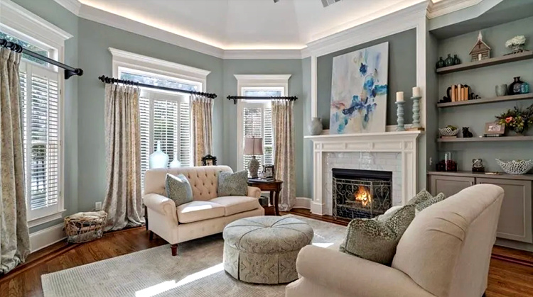
Before
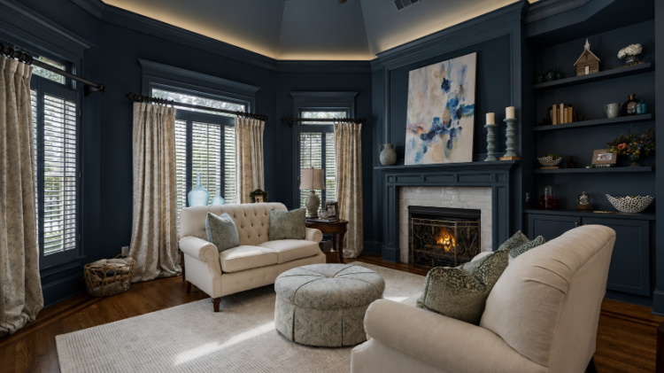
After
The Room That Made Me a Believer
The first time I truly understood the power of color drenching wasn’t in a magazine or on Pinterest. It was in my son’s apartment in New York City.
His guest bedroom had been painted a deep green—almost black—with the walls, trim, and ceiling all the same color.
The room immediately struck me as incredibly cozy and intimate. It felt like it wrapped itself around you.
At the same time, I realized something important.
Because the room had only one small window, the paint color they chose was just a bit too dark for that particular space. The technique was beautiful. The color simply wasn’t the right depth for the amount of natural light the room received.
That experience taught me something I’ve never forgotten:
Color drenching isn’t about choosing the darkest paint color you can find. It’s about choosing the right color for your room.
Why Does Color Drenching Look So Luxurious?
When I walk into a beautifully color-drenched room, I don’t notice the paint first.
I notice the feeling.
The room feels warm.
Comfortable.
Inviting.
Almost as though it’s giving you a hug.
Instead of your eye bouncing from white trim to white ceiling to colored walls, everything flows together. The visual interruptions disappear, allowing the room itself to breathe.
That’s when the furnishings begin to shine.
Beautiful wood furniture.
A favorite piece of artwork.
A leather chair that’s developed character over the years.
A vintage rug.
Layered lighting.
They suddenly become the stars of the room because the walls are quietly supporting them instead of competing with them.
It’s a look that always reminds me of the warmth and elegance of English country homes—comfortable, collected, and lived in rather than overly formal.
How I Used Color Drenching at Foxglove Hill
As we’ve been decorating Foxglove Hill, I’ve found myself drawn to rooms that feel warm, layered, and welcoming rather than stark and high contrast.
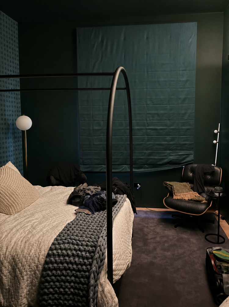
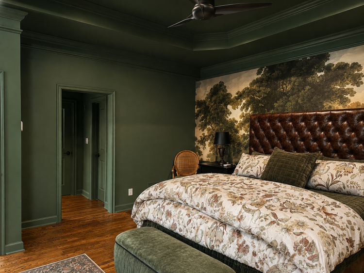
Our primary bedroom became the perfect place to fully embrace color drenching.
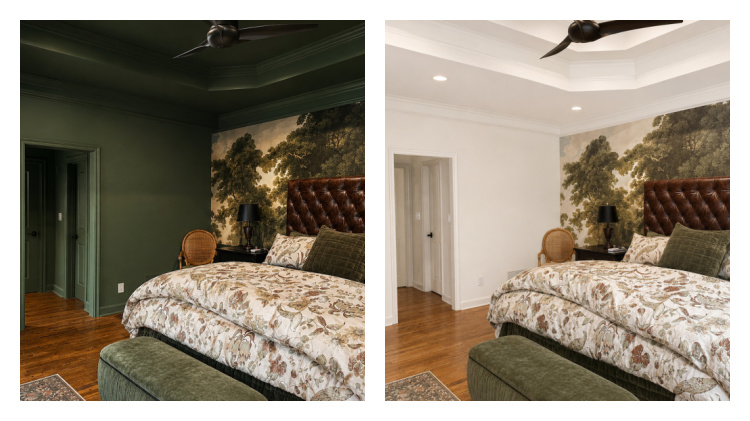
The same bedroom before and after painting. Notice how the darker ceiling visually lowers the height of the room just enough to create a cozy, cocoon-like feeling.
The walls, trim, doors, and ceiling are all painted Benjamin Moore Holiday Wreath, creating a wonderfully cocoon-like feeling that I absolutely love in a bedroom.
Now, I’ll admit I didn’t follow the “rules.”
Instead of painting every wall the same color, I installed a moody woodland mural behind our bed.
Why?
Because it fulfilled the vision I had for the room better than solid paint ever could.
The room still feels completely enveloped in color, but the mural adds depth, character, and a sense of being tucked away in an English woodland.
Every person who’s seen the room for the first time has had the same reaction:
“Wow.”
That’s exactly the feeling I hoped to create.
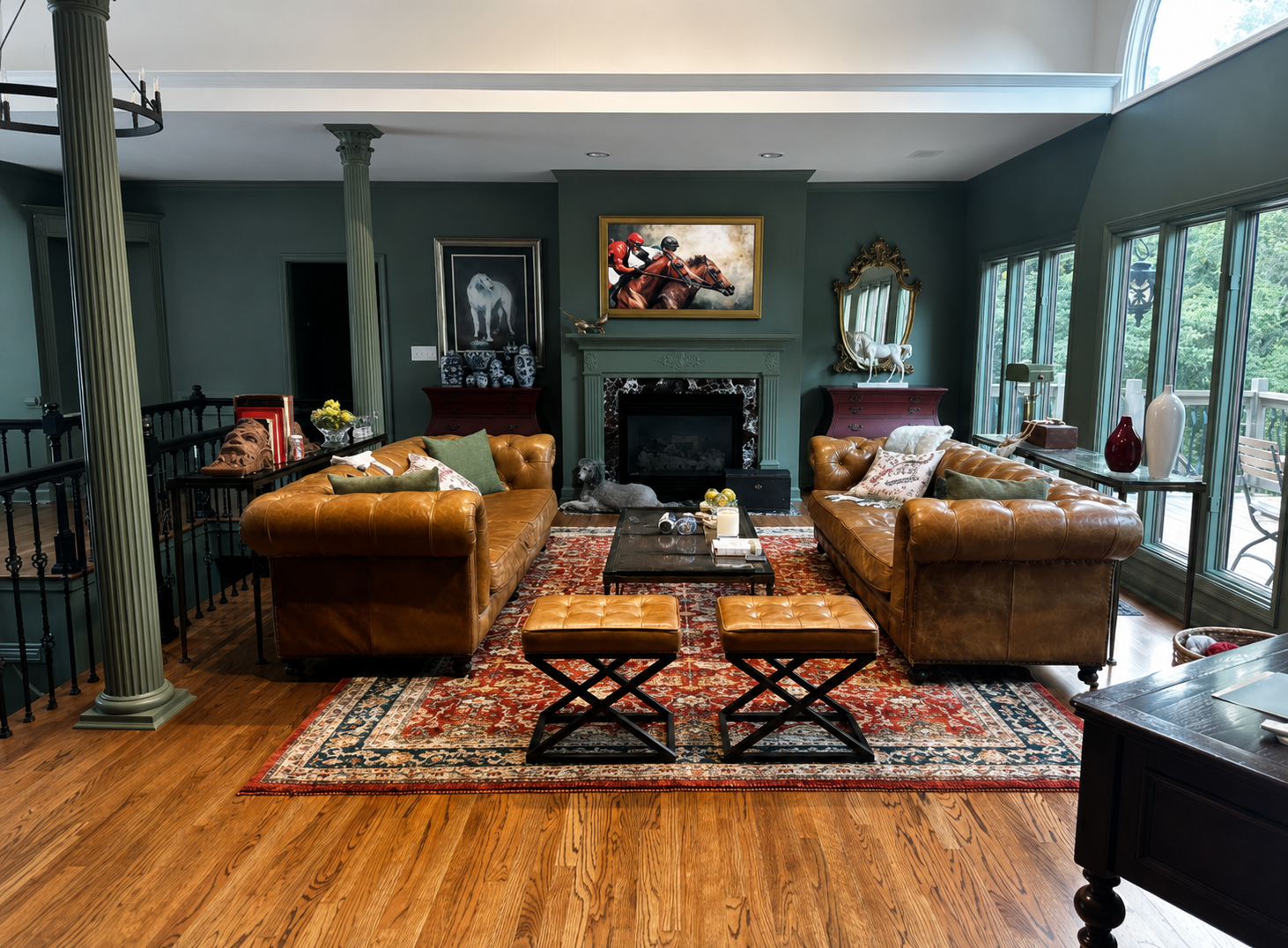
My Living Areas Tell a Different Story
While I fully color drenched our bedroom, I approached our main living spaces a little differently.
The walls, trim, fireplace, columns, doors, and millwork are all painted Benjamin Moore Cambridge Green, creating a beautifully cohesive backdrop.
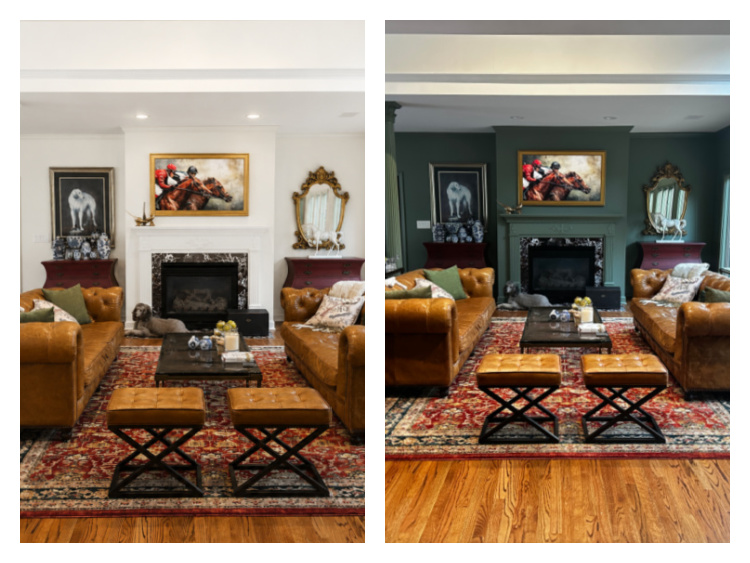
But I intentionally left the soaring ceilings a creamy white.
Why?
Because these rooms have dramatic ceiling height and an abundance of natural light. Keeping the ceilings lighter highlights the architecture while still giving me the warmth and sophistication that color drenching creates.
It’s proof that you don’t have to follow someone else’s formula.
Decorate for your house—not theirs.
The Biggest Mistakes People Make
Choosing a color that’s too dark
One of the biggest misconceptions about color drenching is that it means painting every room almost black.
Not at all.
A room drenched in a soft blush pink, a pale blue, a warm cream, or a gentle sage green can feel every bit as luxurious as one painted in deep forest green.
The feeling changes with the color.
The technique stays the same.
Skipping large paint samples
This is one lesson I’ve learned through experience.
Before selecting Benjamin Moore Cambridge Green, I tested another beautiful color—Benjamin Moore Martha’s Vineyard.
On the paint chip?
Absolutely gorgeous.
On my wall?
From certain angles it looked almost black.
That wasn’t the feeling I wanted.
That’s why I always recommend using large Samplize peel-and-stick paint samples. Even better, place one on every wall in the room because each wall receives light differently throughout the day.
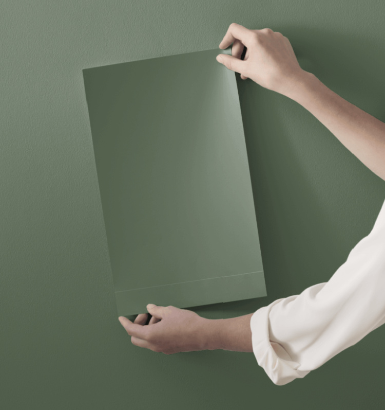
Morning light.
Afternoon light.
Evening light.
You’ll often be surprised how dramatically a color changes.
Thinking paint does all the work
Color drenching creates the perfect backdrop.
It doesn’t finish the room.
Beautiful lighting, artwork, rugs, window treatments, wood furniture, accessories, and textiles are what truly bring the room to life.
Paint sets the stage.
Your decorating tells the story.
Is Color Drenching Right for Every Room?
I don’t believe every room should be color drenched.
Like every decorating technique, it’s simply another tool.
For me, I especially love it in:
- Primary bedrooms
- Libraries
- Home offices
- Dining rooms
- Powder rooms
- Cozy sitting rooms
If your living room has limited natural light or lower ceilings, I’d probably choose a lighter paint color rather than a dramatic dark one.
But don’t let that scare you away from trying the technique.
Remember…
Color drenching isn’t about dark paint.
It’s about cohesive paint.
My Favorite Color Drenching Tips
- Choose your paint color based on your room’s natural light.
- Test large paint samples on every wall.
- View those samples morning, afternoon, and evening.
- Don’t assume darker automatically looks better.
- Bedrooms can often handle deeper colors than large living spaces.
- Don’t be afraid to bend the “rules.”
- Focus on creating the feeling you want.
Final Thoughts
At the end of the day, color drenching isn’t really about paint.
It’s about creating a home that feels welcoming.
When guests walk into Foxglove Hill, my hope isn’t that they notice the wall color.
I hope they feel comfortable.
I hope they feel welcome.
I hope they feel like they can kick off their shoes, settle into one of our leather sofas with a cup of coffee, and stay awhile.
If wrapping a room in one beautiful color helps create that feeling, then it has done exactly what good decorating should do.
Sometimes the least expensive changes make the biggest difference.
And color drenching may just be one of them.
Stunning Chloe! I love the idea of colour drenching. It makes the space so warm and cozy – which is right up my lane! Due to paint my living room soon and will definitely be considering it for this room.